Why did I make this?
We all know portfolio websites, especially for developers.
I never searched for a permanent position, so neither did I feel the urge to build a classical portfolio/resume.
However, I always wanted to showcase my interest in a wide number of subjects through the projects I made.
As I was sunsetting my marti startup, I knew I would use the recovered time to build all the creative ideas that were boiling in my head.
Also, I wanted a personal blog, a space I will own, opposite to big tech platforms.
And finally, as I was writing my ecodesign course for developers, I knew this project would be ideal to test a minimalistic and ecodesigned way to build static websites.
So I made this place, my place, where I share my views and projects. All projects, even the old ones, to share the creative journey of building in very different worlds.
The journey
I started by testing the specific technology used to generate this static site (more on that in the Tech section).
The goal was to be sure that it was smooth to work with and suited for this project.
Then I made a mapping of the existing content (projects and posts) that will be presented on this site.
This helped create a structured definition of a project and a post (including tags, categories, …).
Next, I decided on the smallest scope for the v1:
- Home page: feed layout mixing posts and projects
- Project details: content + facts
- Post details: only content
In terms of content, I chose to include my last 3 projects and 3 posts for v1 and add the rest later.
I wanted this project quickly finished because of the blog section in particular. I had ideas for posts, but no place to publish them!
All this research/planning phase took ~7h.
After that, I started designing.
I wanted a unique design to fit with the “indie forge” / “workshop of ideas” vibe (learn more in the Design section).
So I searched for inspiration online, both for colors and layouts.
Then, I designed the screens. It took way more time than I thought!
I followed a “lean design” methodology by designing and developing in a short loop: I was able to see the shortcomings of my designs way earlier.
In an ecodesign approach, I tried to minimize the size of each page (more in the Ecodesign section).
Usually, in my creator journey, I accepted ditching perfectionism in favor of rapidly publishing a v1.
But on this project, because I was the main user (for now), I put a lot of effort into giving it uniqueness and making every detail perfect.
So this phase took ~105h (yes, that much!). It can be partly explained because I had to get used to a new tech framework, a new design tool, and a new way of thinking about UX.
Finally, I wrote my starting content (3 existing posts and 3 projects for which I had to write this kind of log book content).
It took ~11h.
Then I generated the website and published it on my own server hosted in an eco-friendly data center.
Quite the adventure! Now I will more slowly add content, deeply plunging into (very) old projects.
Design
I made a mood board based on dark background websites with neon colors. And this image from Freepik caught my eye.
I liked the dark background, the vivid gradients, and the glassmorphism touch.
After tinkering with gradients, I chose this “nighty-dreamy” background and those flashy colors.
To keep things simple, all colors were matched to the tailwindCSS expert-designed default palette.
I also tried to implement subtle bits of glassmorphism, using neon vivid colors on blurry backgrounds.
After looking some time for a playful round font, I chose Quicksand for every text.
I considered using a native font stack, to improve the lightness of the project, but it was defaulting to Calibri on my Windows, which is not a rounded font…
Furthermore, I wanted to level up my UX skills by following closely the advice of the RefactoringUI book: fixed colors, spacing, sizes, and the shortest design-to-dev cycle.
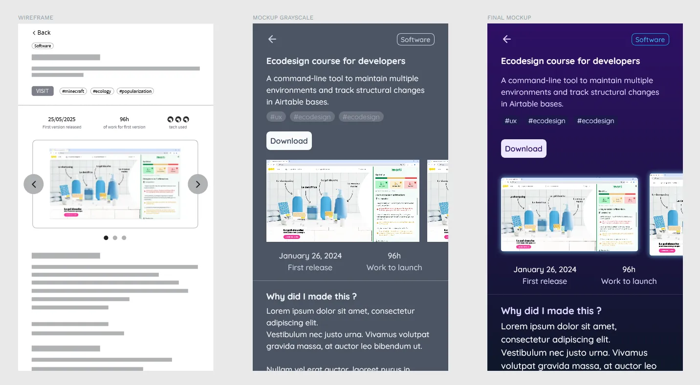
I started with the mobile layout before wider screens and with basic wireframes before high-fidelity mockups.
I followed this “lean design” process for each screen:
- Design wireframes to nail layout.
- Design high-fidelity grayscale mockups to get the right hierarchy.
- Add colors.
- Develop the colored version to see how it looks on a real website.
- Make some adjustments (most of the time spacing and sizing) to improve the developed version.
- Report these edits on the mockups to keep them up to date.
For the design environment, I decided to go back to Penpot to see the progress they made (quite a lot, even if it’s still missing critical features like prototype scrolling…).
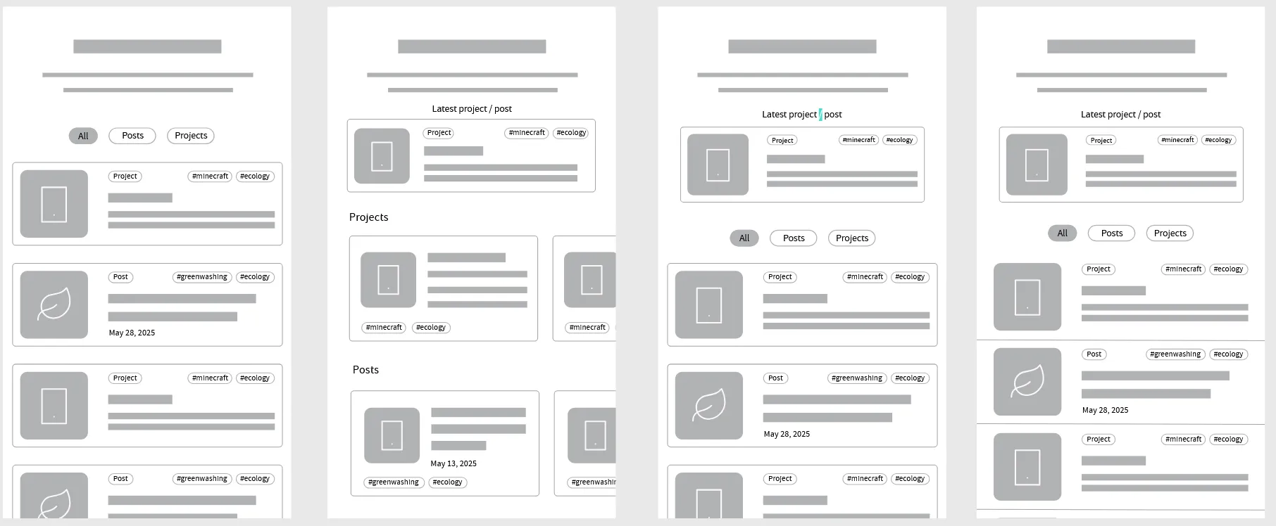
The most difficult thing to design was the “unified feed” of the home page. I answered these questions :
- How could both projects and posts be visible in the same page without requiring user action?
- Which information should stand out at first glance for each project or post?
I asked for feedback from ~10 people for these structural layout choices, asking them to choose between A and B versions.
Many thanks to Thomas in particular, who spotted many beginner mistakes (like grid and contrast).
I also asked Gemini 2.0 for its opinion, which helped me have an instant appraisal.
Tech
On the tech side, I decided to give a shot at Astro, a javascript framework designed to generate static websites.
What is a static website?
Well, most of the websites out there are dynamic: each page renders on-demand when you visit it. It helps enrich it with the latest data (e.g., price changes on e-commerce) and make it respond to users’ actions.
But for this kind of website (blogs, landing pages) with not much interactivity, on-demand rendering is overkill.
Enter static websites, which are generated when their content is updated (usually by a human). Because only a basic server is needed to serve them, they are so much lighter in terms of computing resources utilization.
No server or client rendering step is needed when the user visits a static page. And they load almost instantly.
Astro has something even better: the ability to code components (using well-known frameworks like React) to create islands of interactivity.
It means that by default, no javascript is shipped to the client. And when you add these islands, Astro will only ship the minimal required code to make them work.
That’s why I think it’s the perfect way to create simple ecodesigned websites: it combines the familiar workflows of classic web dev with by-default sobriety.
I paired it with the Svelte framework to code the small interactive features (like the home page filters), which is also well known to be lightweight.
For styling, I used the famous TailwindCSS, which is tree-shakable, meaning all unused features will be excluded from the generated website.
Development with Astro was a breeze; I mostly struggled with modern CSS issues to get the exact look I designed. Github Copilot was bad at helping me fix them. Gemini was perfect for the job. I also had some issues with the development server not catching changes (even if it uses Vite?).
Each project and post is written in Markdown, also a main feature of Astro, which means I can edit them easily without a heavy CMS editor (👀 Wordpress), nor a database.
Finally, I deployed it on an Infomaniak VPS, which is currently my go-to host because of their strong ecological commitments.
The site is auto-updated every time I commit changes to the git repository, thanks to Coolify (the self-hosted Vercel-like).
Ecodesign
The objective of all these tech choices was to reduce the footprint (in terms of storage, bandwith and compute resources) of the website.
As an example, this page weighs 250KB on the published website, 10x less than the current median page weight, by having the least possible interactivity.
In fact, the home feed is almost the only feature which reacts to user actions.
And everything is optimized:
- minified code
- compressed images (max 3 per project)
- static pages
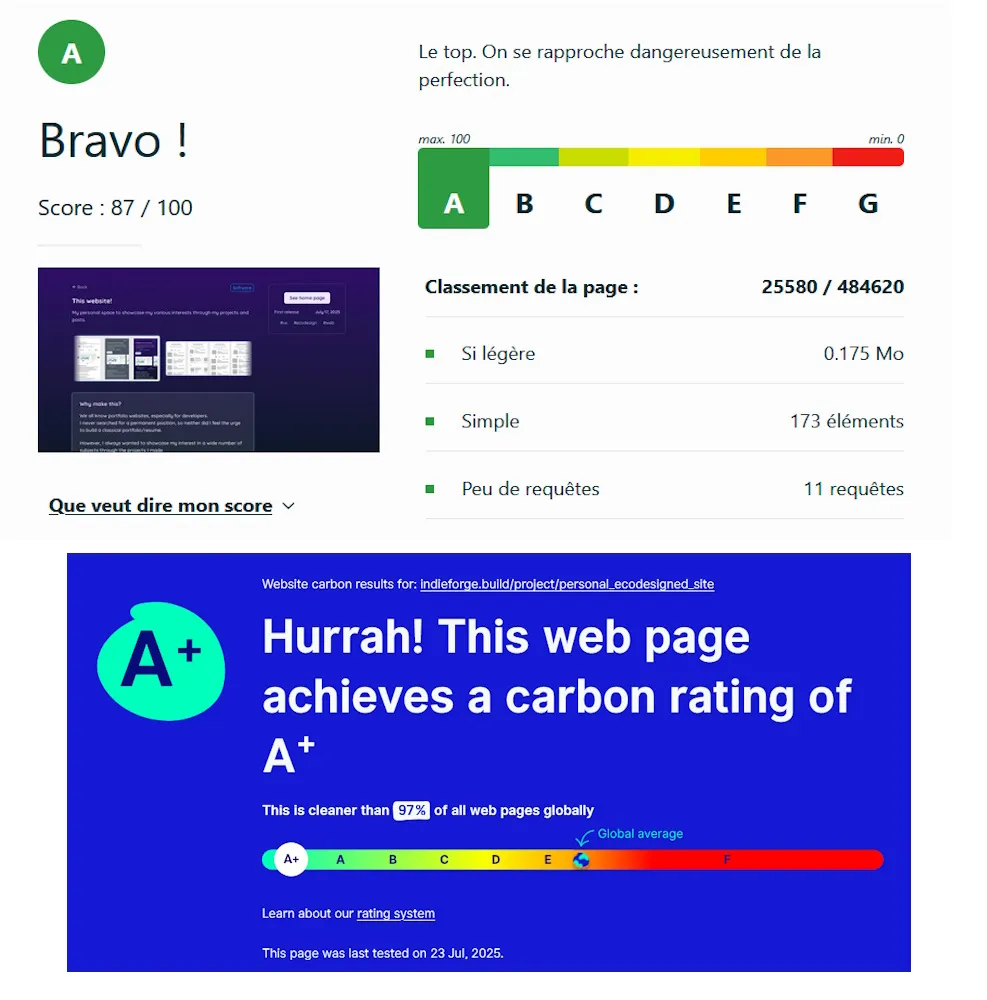
In my ecodesign cours for developers, I present several tools (and their limits) to assess the environmental footprint of a website.
You can see the grades of these tools at the bottom of every page.


